Mic check one two one two
The Vera Project is a non-profit, all-ages music venue, and youth-led arts space located in the Seattle Center. The venue has built a strong community on its core values of creativity, youth empowerment and leadership, and support for local artists and musicians.
On a mission
While The Vera Project is well-loved and well-known in the local music scene, in order to better serve their mission—and expand their reach—the brand’s current DIY spirit could use some structure to give it a little extra authority and a touch of creative energy to better reflect their values.
The challenge for this assignment was to create an identity for The Vera Project that kept their DIY spirit but communicated to a wider audience and had enough structure to build out a number of brand touchpoints.
Doing our homework
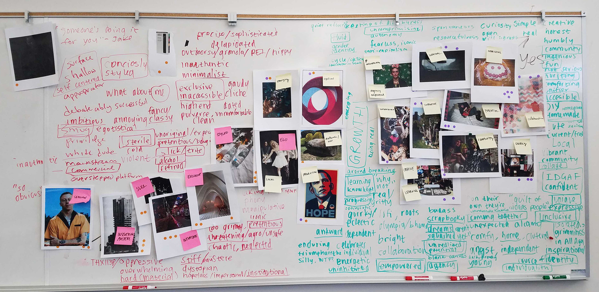
Together with Kayli Putaportiwon, Jake Levin, and Adam Smith (each of whom had individually decided to re-brand The Vera Project) we did some research into the brand:
History & Audience
The Vera Project started as a DIY response to the city’s overbearing Teen Dance Ordinance, a law that made all-ages concerts “prohibitively expensive and difficult to produce.”
The Vera’s independent and scrappy spirit has defined it ever since. As it expanded to include audio classes and workshops, a screenprinting studio, an art gallery, a cafe, a zine library, and more, it has stayed true to it’s mantra: always all ages.
Perception & position
The community powered venue is a place that provides affordable performances and hands-on learning opportunities for creative expression. It is a platform for young people to find their voice, and gain experience in both technical and leadership roles.
Synthesizing our understanding
As a group we decided on three characteristics that defined the brand’s identity:
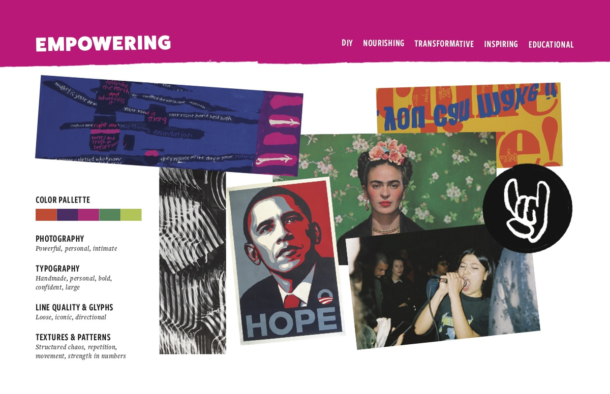
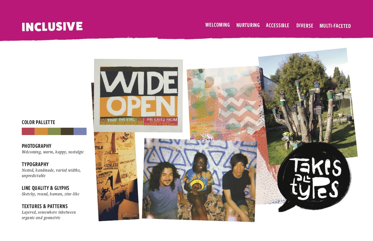
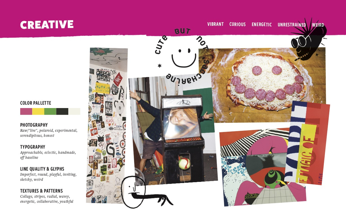
The Vera Project is creative, inclusive, and empowering—committed to building community through music and art.
From there we individually built out moodboards that defined how each characteristic was represented visually.
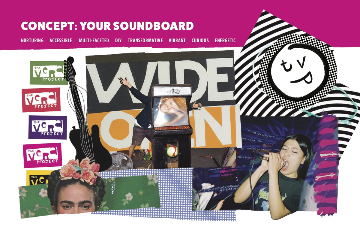
Your soundboard
The research we did and the moodboards for each brand characteristic served as a guide as I developed the overarching brand concept, Your Soundboard.
The Vera Project, as a community institution, acts as a cool but trusted mentor—like an older sibling who encourages their siblings to grow and try new things. They’re there to take you to expose you to new music and experiences, to show you how to screenprint, and give you a safe place to grow and meet new people.
⚠️ Forced metaphor zone
If you’ll indulge me further, much like the soundboard of an instrument that is designed to amplify the voices of strings, The Vera Project is a channel through which the ideas and voices of young people are magnified and strengthened.
And! Like a mixing console that blends a diverse source of inputs, The Vera Project is a place for people of varied backgrounds to build community.
Okay, end of forced metaphor zone.
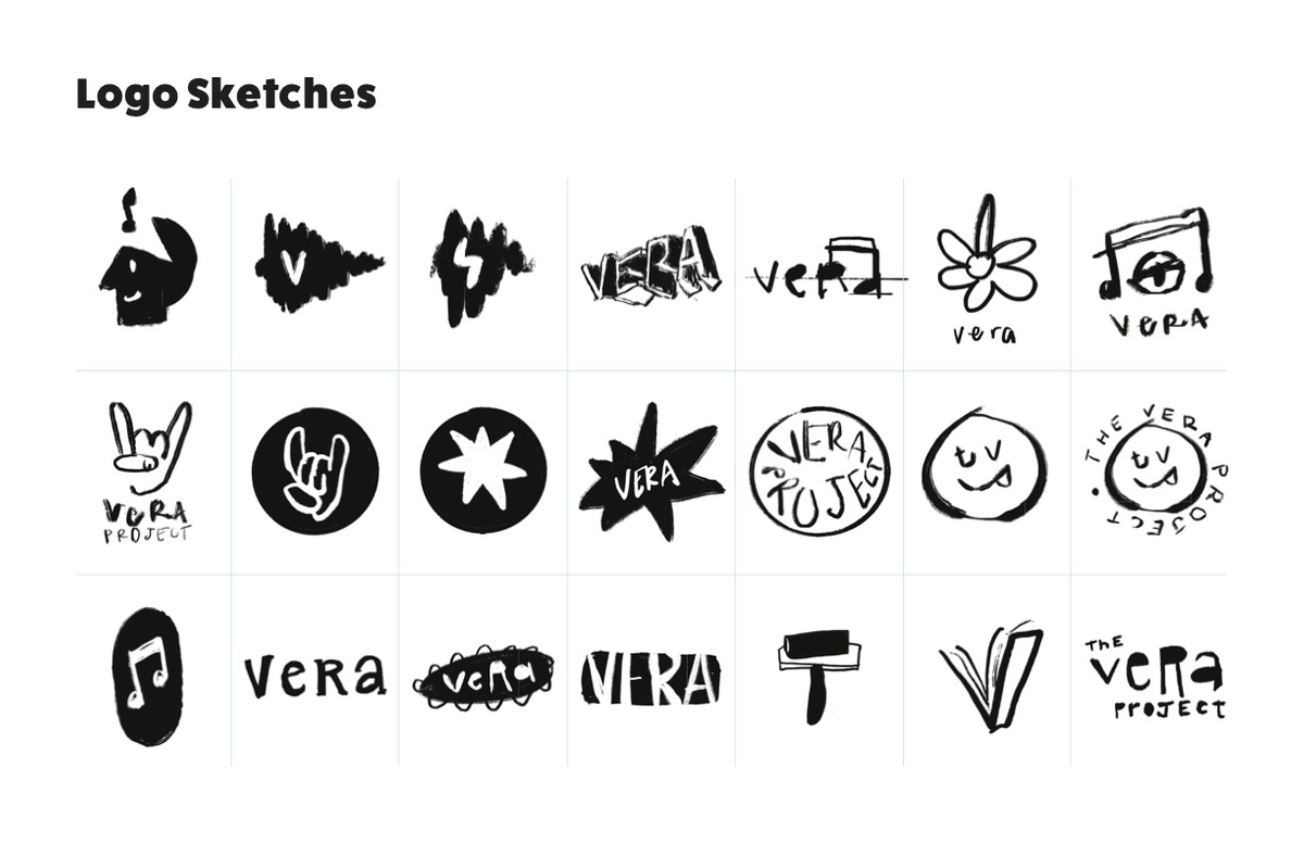
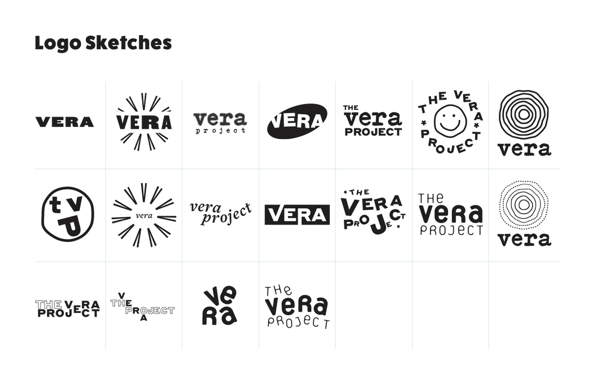
Time to jam
With a brand concept solidified I began to build the “kit of parts” that would be the basis for all future brand assets. That meant defining type, color, illustration style, how photography was to be treated, and of course, the wordmark.
After experimenting with both vector and illustrative logomarks, it became clear that the rougher and looser direction better suited the DIY and expressive characteristics of the brand.
That decision led to the development of illustration and texture suites that became the cornerstone of the brand: expressive, fun, and welcoming.
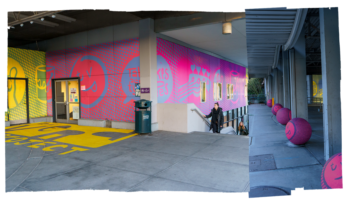
The illustrations were used as tiles that linked the backs of individual business cards and wrapped the entire building, emphasizing the strength and diversity of the Vera community.

Let’s take this thing on the road
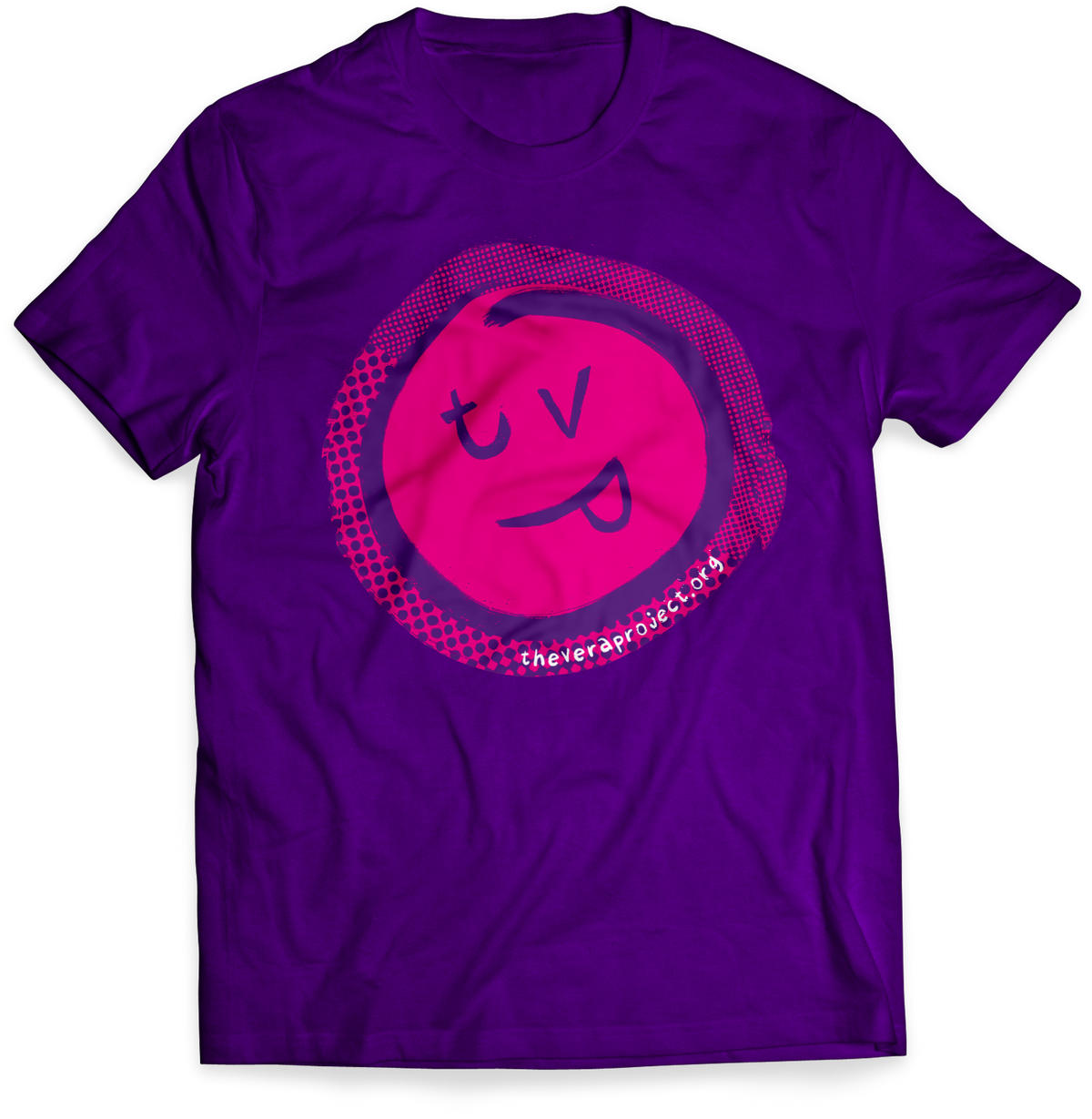
The rough textures, loose illustrations, and vibrant colors were crucial to this re-brands communication of the creative, inclusive, and empowering values of The Vera Project.
Additionally, the full brandbook defined a structure for the Vera personality to grow with consistency and trustworthiness.
In further iterations of this project, I think it would be useful to create a scale of The Vera Project’s expression. Visually detailing how the brand is expressed in a more composed setting (say, Vera letterhead) to more exciting and activated environments (social media posts, or other Vera-owned content).
I think it would also fit the brand to have guides on how to imprint your personality on the brand. The brandbook has a guide on how to add to the illustration library, but I think it could be expanded to include personalized textures and handwritten fonts for the more expressive touchpoints.