Yuppies Puppies
Today’s young professional pet owners—I mean, pet-owning isn’t their profession, they just are professionals who happen to own pets—are willing to spend a little extra on their balls of fur if it means higher quality and ethically sourced ingredients.
This wave of conscious consumers has had a big impact not only on products but on their packaging as well.
Dog-eat-dog-food world
The challenge of this assignment was to develop a brand identity and a new line of products for the fictional, Walla Walla, Washington based pet food company, Swauk Creek.
The competitive pet food market presented an opportunity for something a little unexpected but with careful consideration of the target audience:
Swauk Creek’s identity ought to speak to the young professional pet owners with an approachable visual style while fulfilling the environmental standards of an ethically sourced pet food product.
Finding our bark
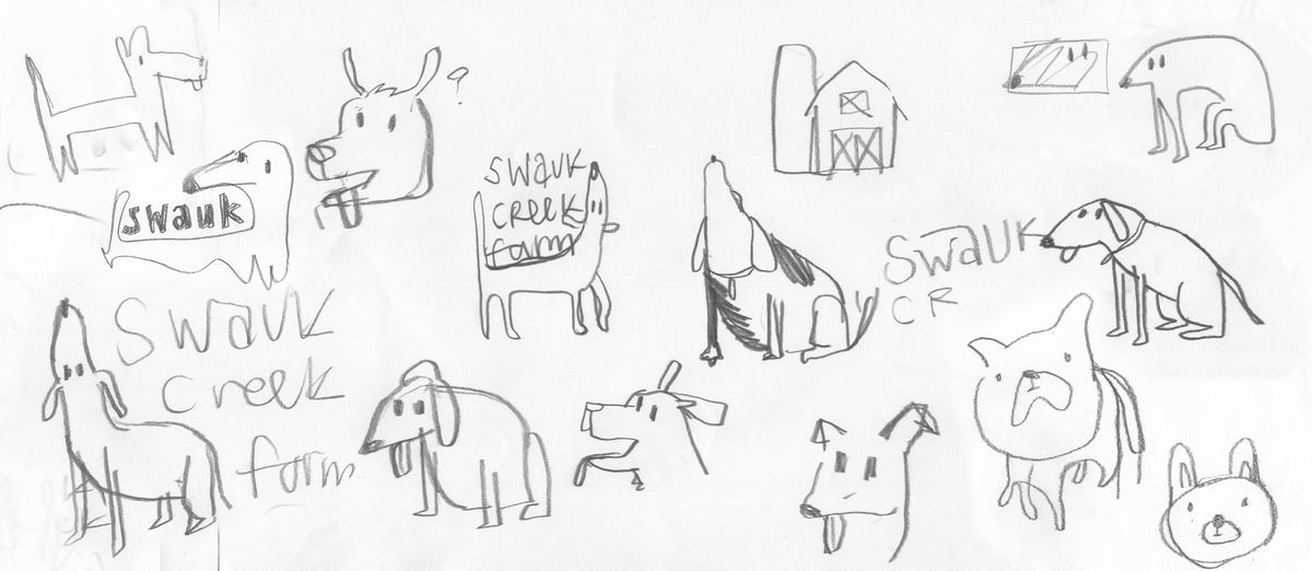
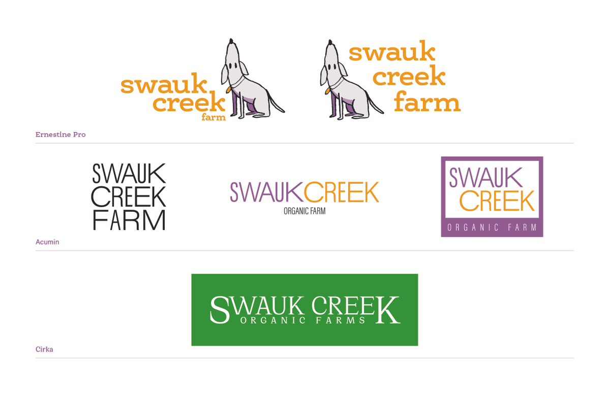
The first step in the process was to define Swauk Creek’s visual identity—you’ve got to bark before you can run! In this case, that meant quickly surveying the competition, getting inspiration, and then exploring three different visual directions for a potential logo.
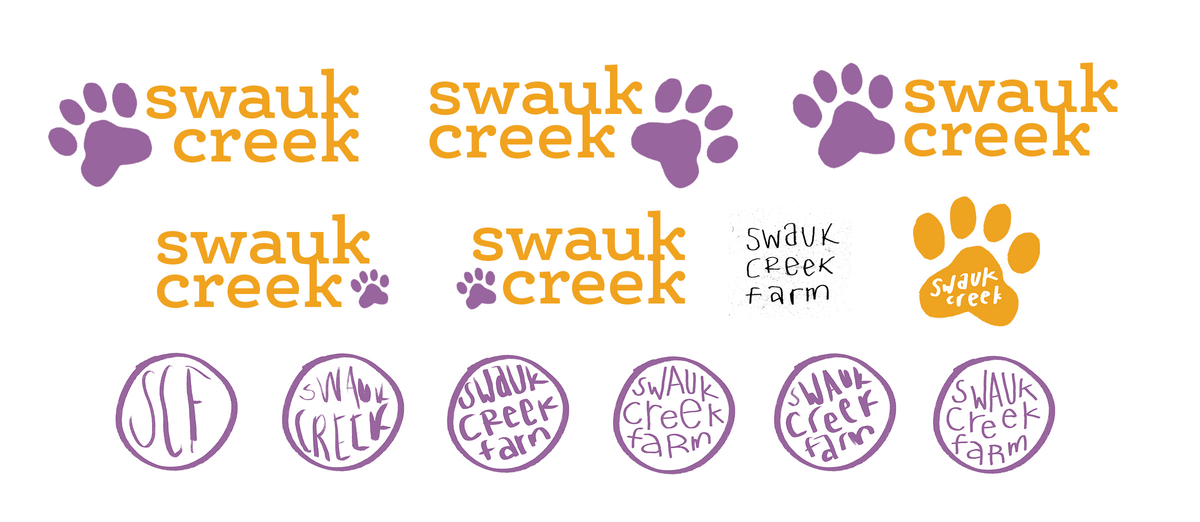
The strongest of the three made use of all lower-case Ernestine Pro, a chunky, round, and friendly typeface that paired nicely with an illustration. This look successfully delivered the approachable style, but needed a little more exploration to get a neater lock-up.
Packaging it all up
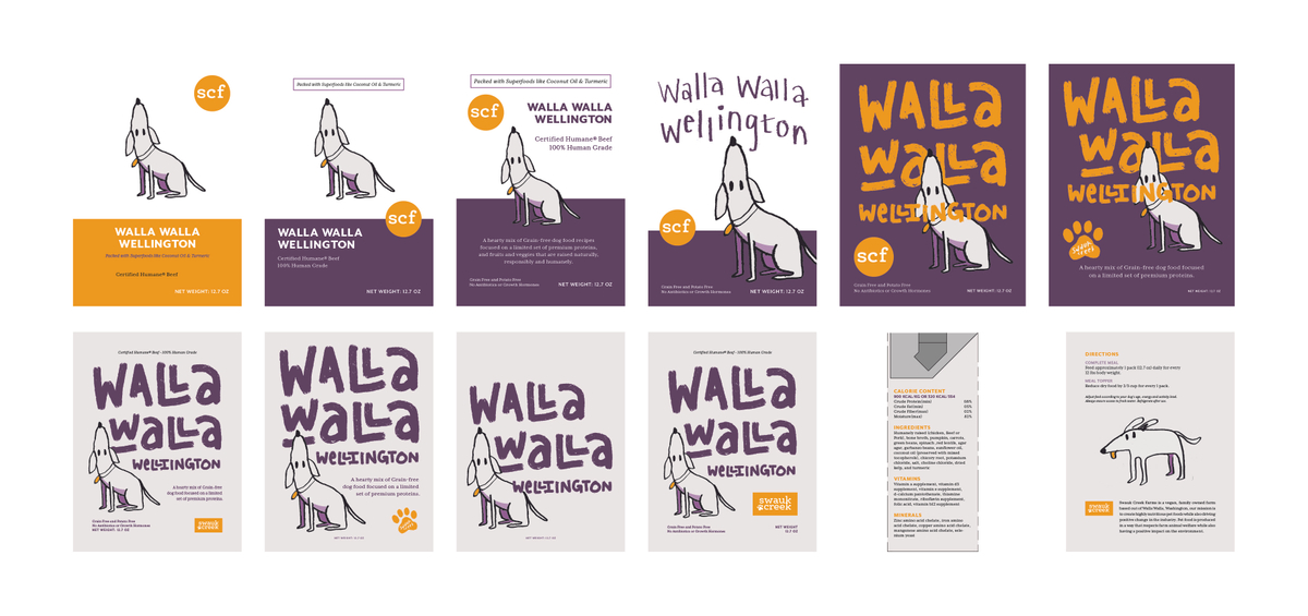
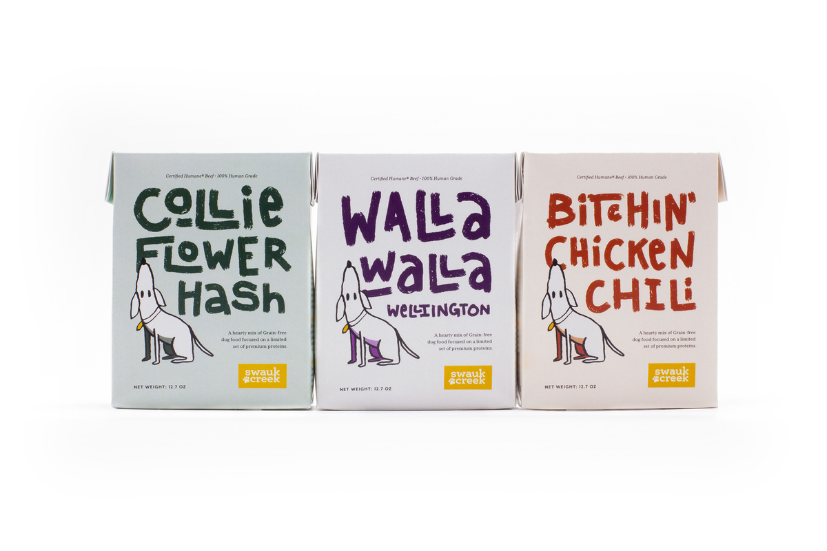
With a general sense of the visual direction, I began to lay out the front of the packaging, focusing on my initial flavor of Walla Walla Wellington in order to create a template for the others.
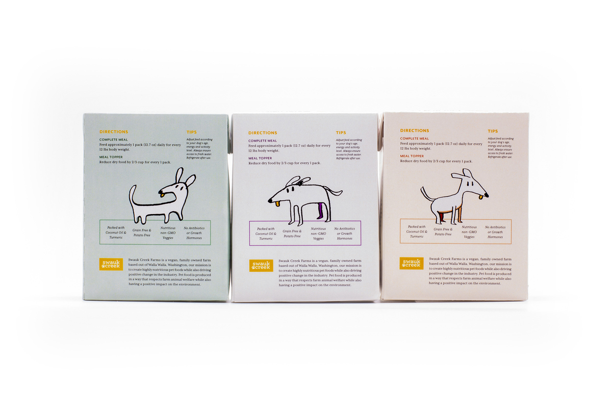
After a modest amount of research on environmental packaging, I discovered TetraPak’s TRC 340, a package that takes up 30% less space and weighs ~60% less than a can, reducing transportation impact and carbon emissions. With dielines in hand I began sketching out possible comps.
This process revealed how important the illustration was to the brand identity. The initial designs that relied on Mr Eaves to convey the name of the flavor lacked personality and competed with the illustration. It soon became clear the type had to support that message and that required some hand lettering.
Doggone it, that’s it!
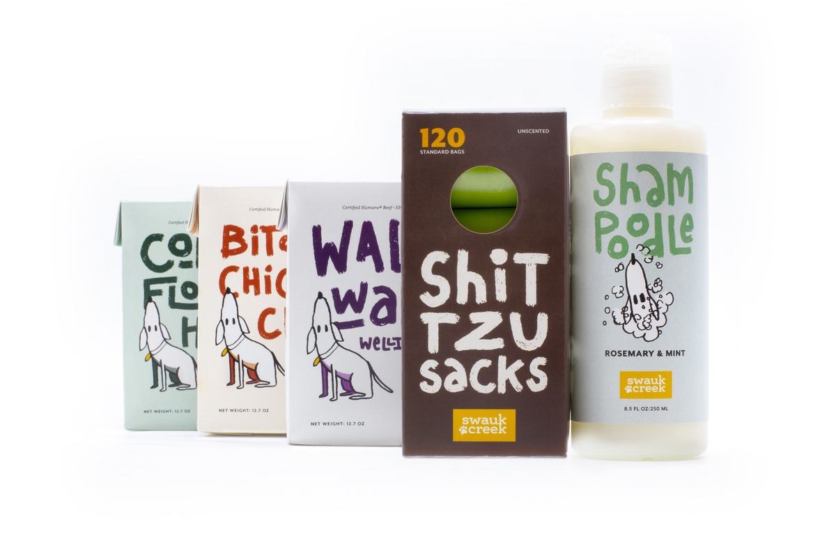
The remaining flavors, Collie Flower Hash and Bitchin’ Chicken Chili were easily adapted to the template and maintained the brand’s identity both visually and tonally.
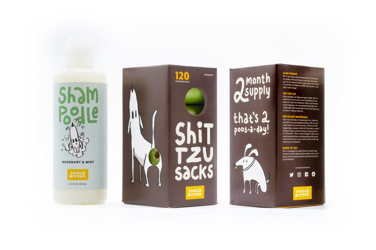
In addition to the new line of dog food were two pet care products: a pet shampoo, Shampoodle, and dog poo bags, or Shit Tzu Sacks.
The final identity and line of products had just the right amount of humor and charm to appeal to the audience of young professional pet owners and help them get through the pain of picking up another being’s shit.